Trending Typefaces and Type Styles 03

Made Somewhere takes a deep dive look into an array of modern typefaces with subtle features, including ink trapping and spreading.
The following typefaces GT Pressura, PolySans, and Clifton are visually striking and distinct, yet flow with ease and clarity.
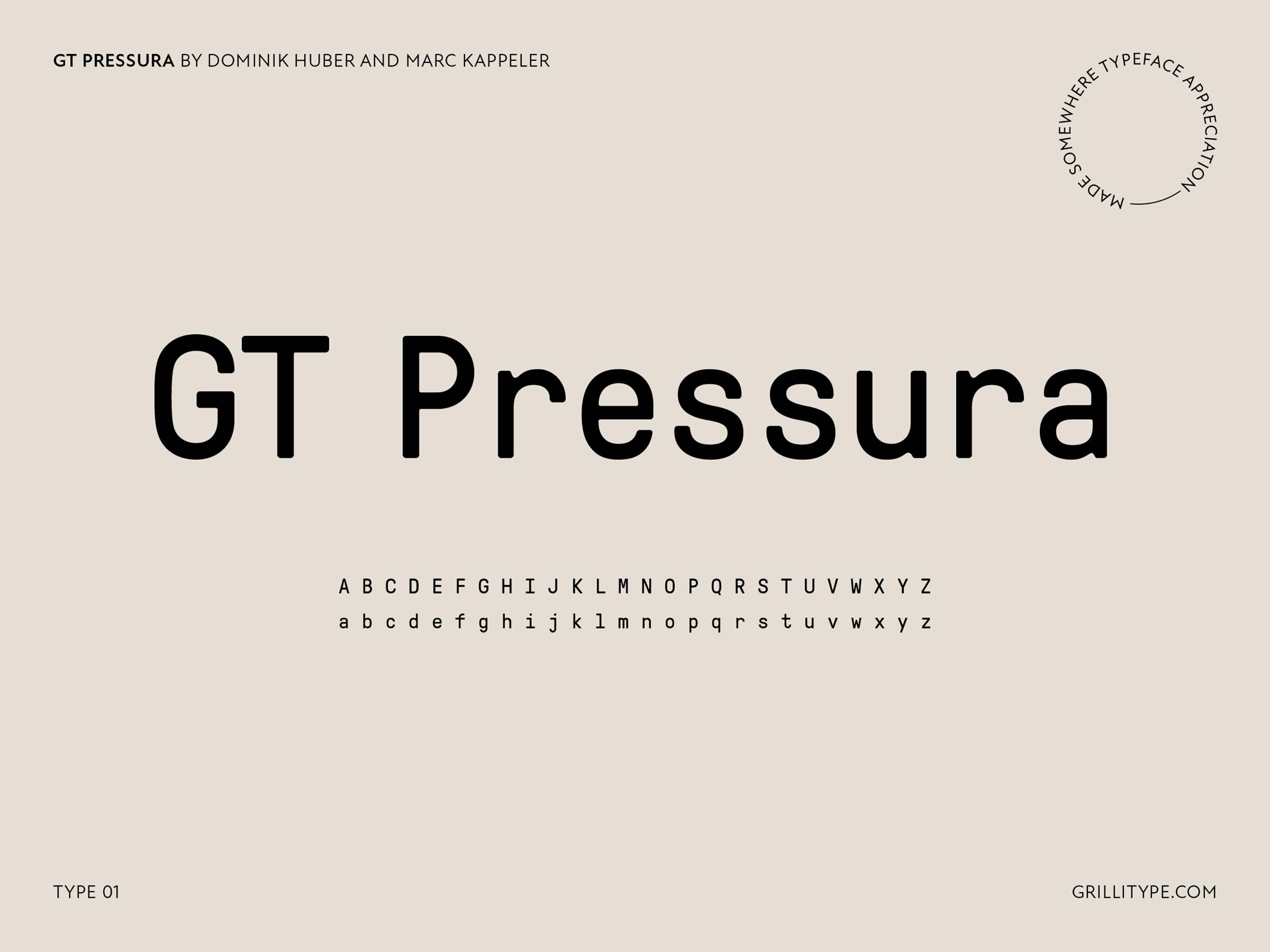
GT Pressura by Dominik Huber and Marc Kappeler
GT Pressura is inspired by metal-type printing history as well as engineered letters stamped onto shipping boxes. It uses the visual gesture of ink spreading under pressure as a stylistic device, offering an alternative to more spindly typefaces of the digital age.

PolySans by Milos Mitrovic
PolySans is a fresh take on mid-20th century classics, visually distinct from its predecessors by a subtle soft-edge inktrap feature. While the Roman styles embrace conservative proportions and dynamic, its exaggerated italic forms break all genre rules to a degree where its concept almost takes the shape of a script serif, but still calmly rolls back to its non-italic interlocutor. PolySans comes in proportional, monospaced, and wide cuts which makes it highly versatile companion to any design task.
We Are Gradient: PolySans by Milos Mitrovic

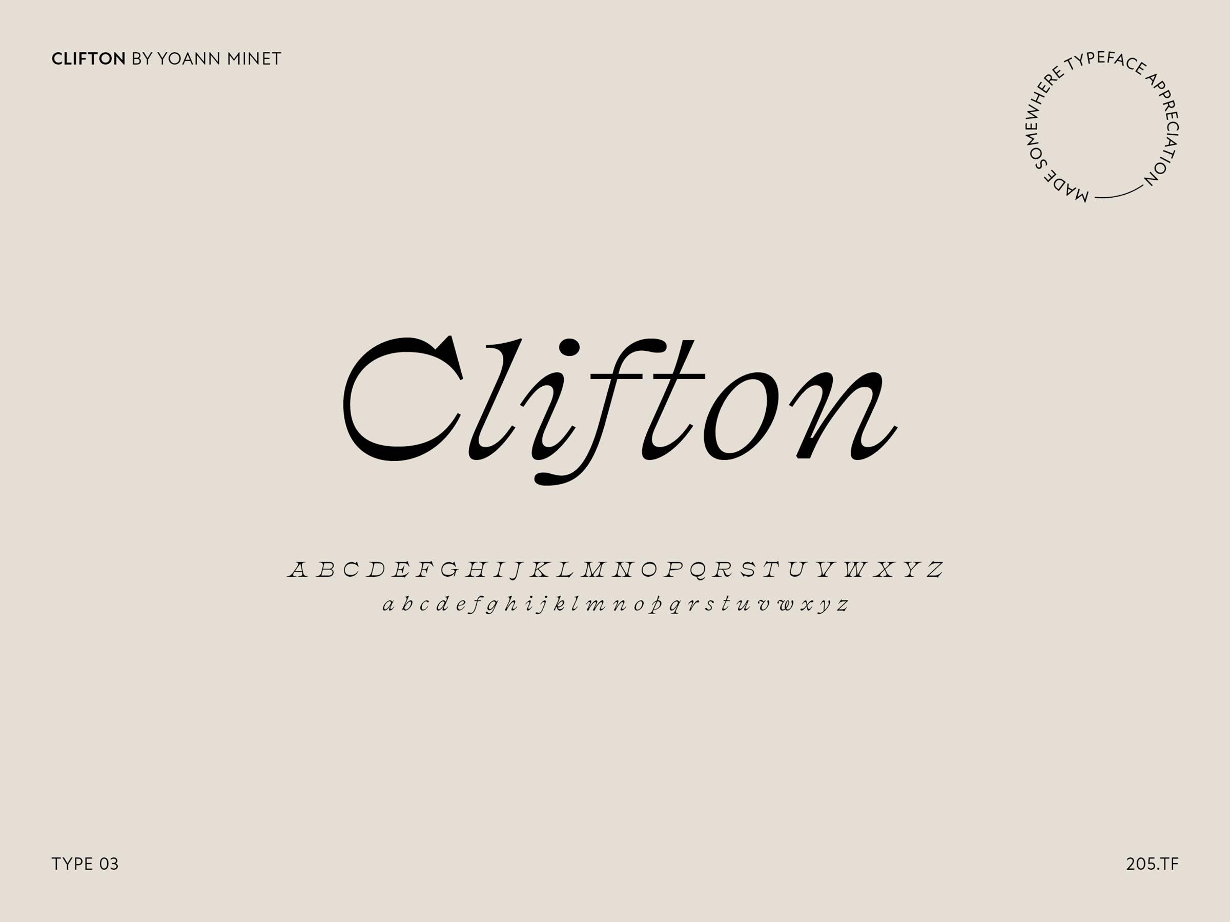
Clifton by Yoann Minet
Clifton – inspired by the Athenian typeface of the British Type Foundry of 1896. Structured with both finesse and contrast, this typeface exudes confidence and style. Its distinctive character and slender style makes it a unique choice for added depth and engagement.

Additionally, you can see other fantastic options in our other posts – Trending Typefaces and Type Styles 02 and Trending Typefaces and Type Styles 04. Without a doubt, there will be more typefaces that will assist you with your next project!
*Made Somewhere has written this post to provide a personal admiration for these typefaces to help other designers. Lastly, we’re not paid or endorsed to write this post in any way.